Design System · Vertical Writing Systems

Designing Interfaces for Vertical Writing Systems

A living design system exploring interaction patterns for vertical interfaces.

Try the Playground ↓
The System in Motion

Interaction, demonstrated

Four core patterns replaying as they behave in a vertical, right-to-left interface — every motion follows the reading axis.

01
Vertical dialogTitle, body, and actions read as columns, right to left — the overlay is a layer above the flow, so it scales from center.
02
List-cell toggleThe on/off thumb travels the reading axis — up is on — and flipping it re-themes the panel, so the toggle matches the direction the eye moves.
03
Column accordionDisclosure widens the cell sideways: detail unfolds as new columns beside the title, so the column's reading length never breaks.
04
Tooltip on hoverHover still exists in vertical UI: the tooltip opens to the left of the trigger — following reading direction — never below, where it would break the column.
View all components →
Applications

Real Implementations

What happens when vertical-first thinking is applied to actual product categories.

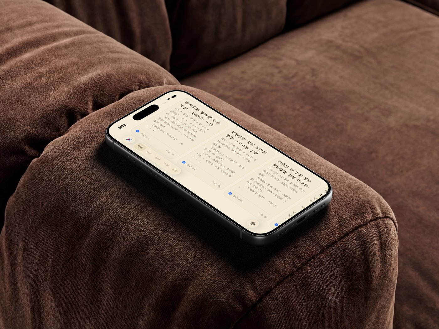
Vertically VerseLiveiOS

A fully vertical, right-to-left scripture reader for Korean, Japanese, and Chinese. Every control, gesture, and transition rethought for the top→bottom, R→L axis.

Demo coming soon
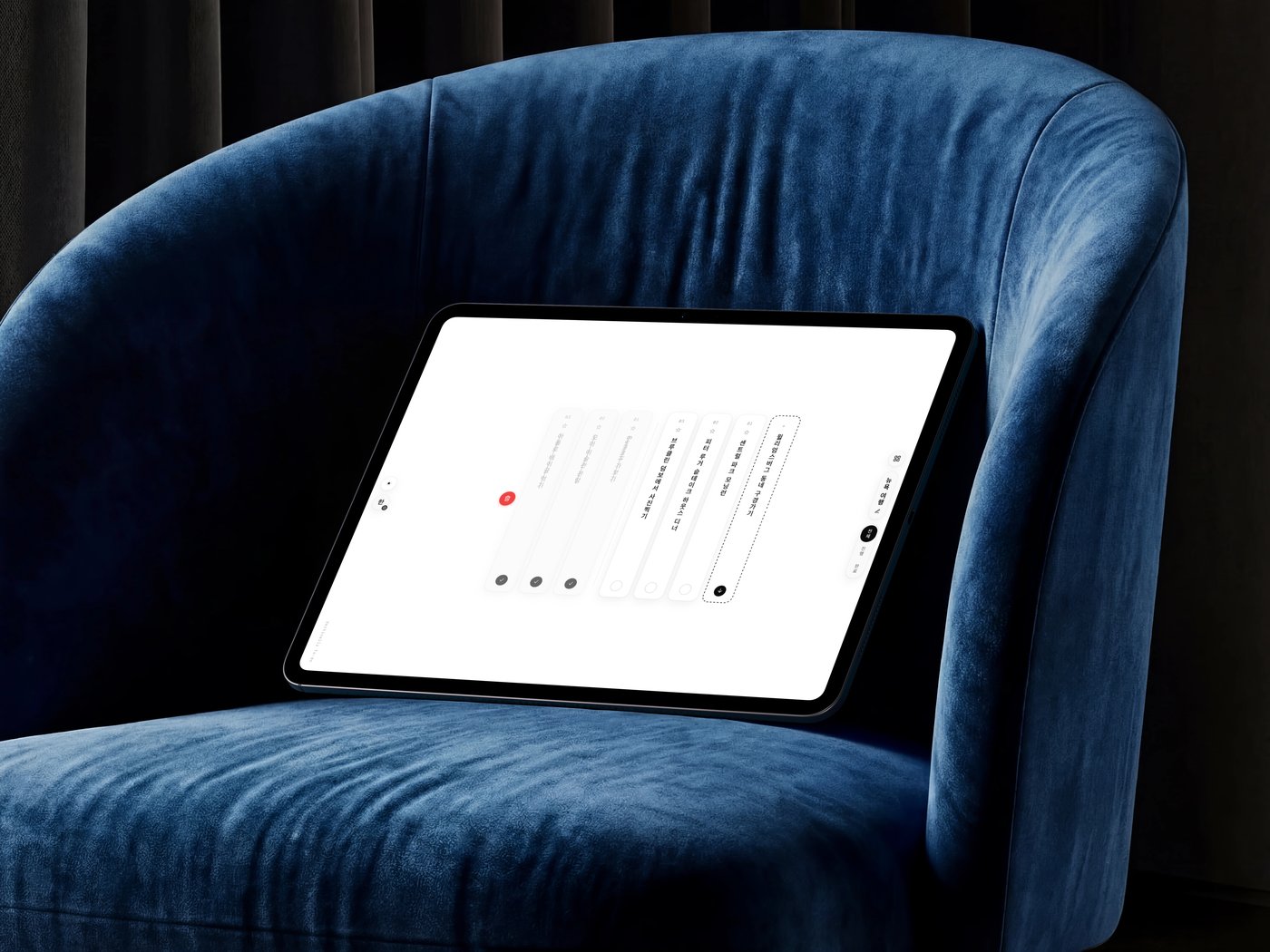
Vertically DoLiveWeb

A to-do list where tasks are columns read top→bottom. Drag a column down to delete, sideways to reorder — and flip the whole interface across 한 / あ / 中.

Demo coming soon
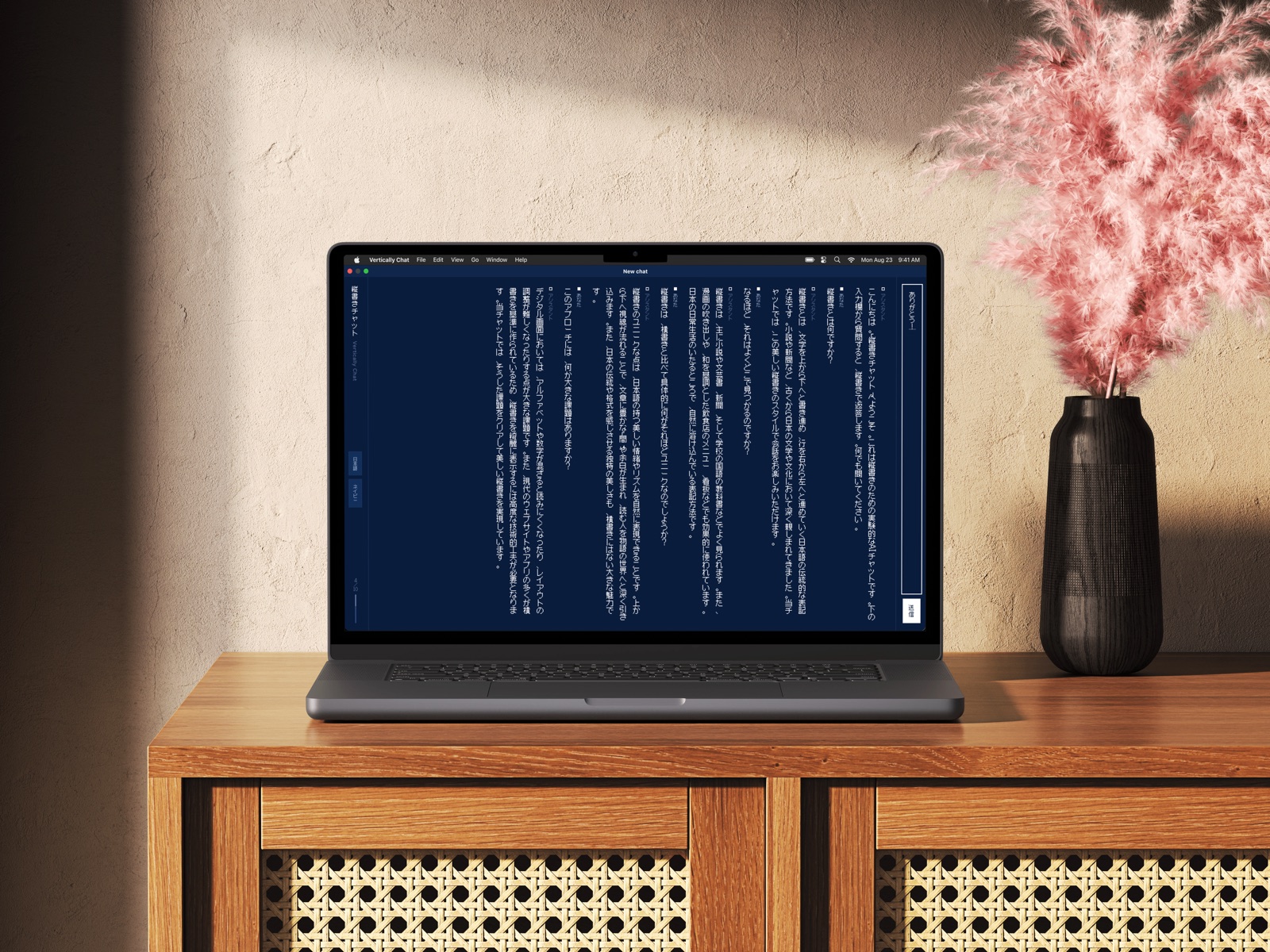
Vertically ListenLiveWeb

A podcast player where today's top CJK shows stack as a shelf of full-height columns, and time-synced transcripts fall as vertical verse. Reading stays vertical; transport stays horizontal.

All applications →
Challenges & Principles

What This Project Explores

Open questions, and the principles derived from trying to answer them.

01Motion

Should a sheet animate from screen geometry or reading direction?

Screen geometry says slide up; the reading axis often disagrees. Motion has to pick a side.

02Typography

How should mixed CJK and Latin content behave in the same column?

Dates, names, and references mix scripts — and each glyph class needs its own orientation.

03Navigation

Where does the navigation rail belong in a vertical-first interface?

Columns read down and pages flow right-to-left. Neither a bottom bar nor a left rail maps cleanly.

04Interaction

How does text selection work when reading flows top-to-bottom, right-to-left?

Drag-to-select assumes horizontal baselines. In vertical columns the anchor sits at the top and selection crosses columns rightward.

Derived Principles
01

Respect Reading Flow

Begin with how the reader moves, not convention.

02

Motion Has Meaning

Animation reinforces reading direction, never decoration.

03

Interaction Before Typography

Behavior is the goal; typography enables it.

04

Mixed Language First

Design for mixed scripts, not the average.

05

Accessibility Is Fundamental

Keyboard, touch, screen reader, reduced motion, built in.

06

Research Never Ends

Document open questions beside resolved ones.

Playground

Try it yourself

The full playground, embedded. Language, writing and reading direction, theme, device, and type size — every control updates the canvas live.

Controls
Language
Writing direction
Reading direction
Theme
Device
Font size22px
Preview한국어 · vertical · RTL

글씨를 세로로 쓰는 것을 세로쓰기라 한다.

Open the full playground →