Applications

Real Implementations

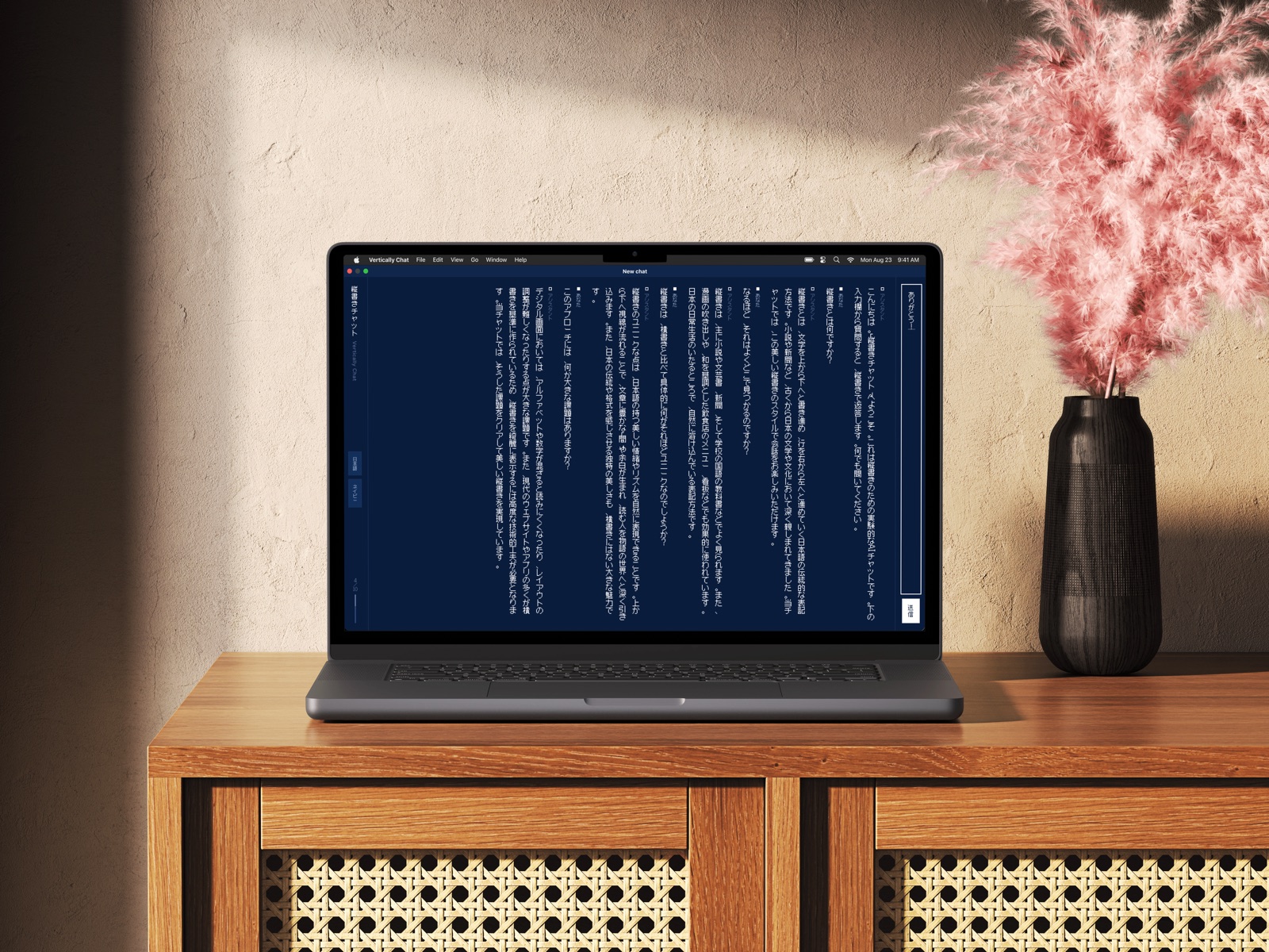
What happens when vertical-first thinking is applied to actual product categories. Each application surfaces a different set of design challenges.

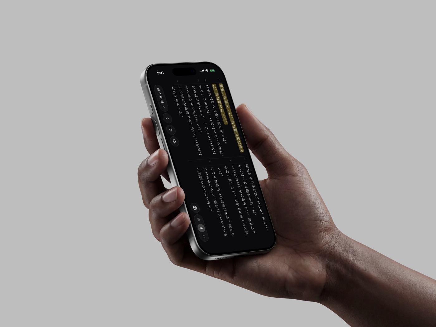
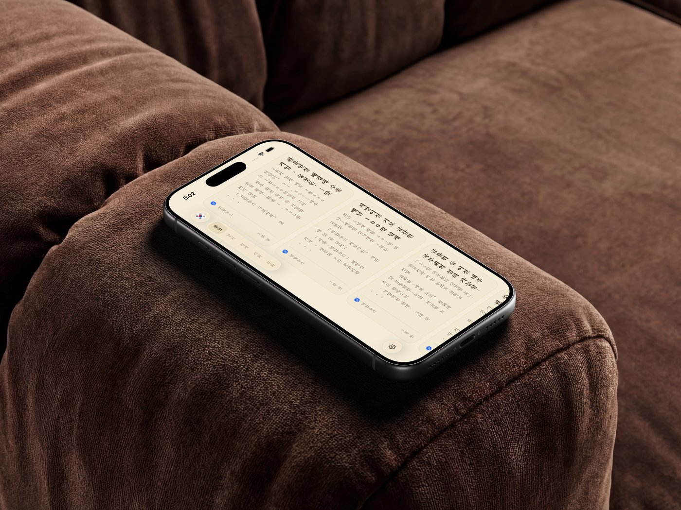
Vertically Verse

LiveiOS

A fully vertical, right-to-left Bible reader for Korean, Japanese, and Chinese. Every control, gesture, transition, and reading affordance rethought for the top→bottom, R→L axis.

  • Column-based layout that snaps per column, not per page
  • Tate-chu-yoko (縦中横) for verse numbers and digit groups
  • RTL-native chrome with scroll-driven immersion
  • Horizontal pull-to-paginate for chapter navigation
  • Mixed CJK + Latin glyph orientation per character kind

To-do

LiveWeb

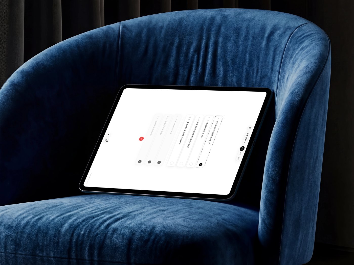
Vertically Do — a to-do list rethought for the vertical, right-to-left axis. Tasks are columns you read top→bottom, newest at the reading start; drag a column down to delete (a trashcan opens behind it in the vacated slot), sideways to reorder, and switch the whole interface across 한 / あ / 中.

  • Tasks as full-height columns that stack right→left and scroll on the column axis
  • Vertical pull-to-delete with a trashcan revealed behind the card
  • Orthogonal drag axes — vertical deletes, horizontal reorders
  • contentEditable vertical-text input that stays column-centered
  • 한 / あ / 中 language toggle re-localizing the entire interface

Music

PlannedConcept

How should playback controls and album art behave in a vertical interface?

  • Where does a timeline scrubber sit when the reading axis is vertical?
  • How do playlist items stack — columns or rows?
  • What does a volume control look like on the vertical axis?

Maps

PlannedConcept

How do directional labels and navigation instructions adapt to a vertical reading axis?

  • Place name labels in a horizontal map vs a vertical reading interface
  • Turn-by-turn directions: vertical list or horizontal carousel?
  • Search results and location details in vertical columns