On iPhone Duo
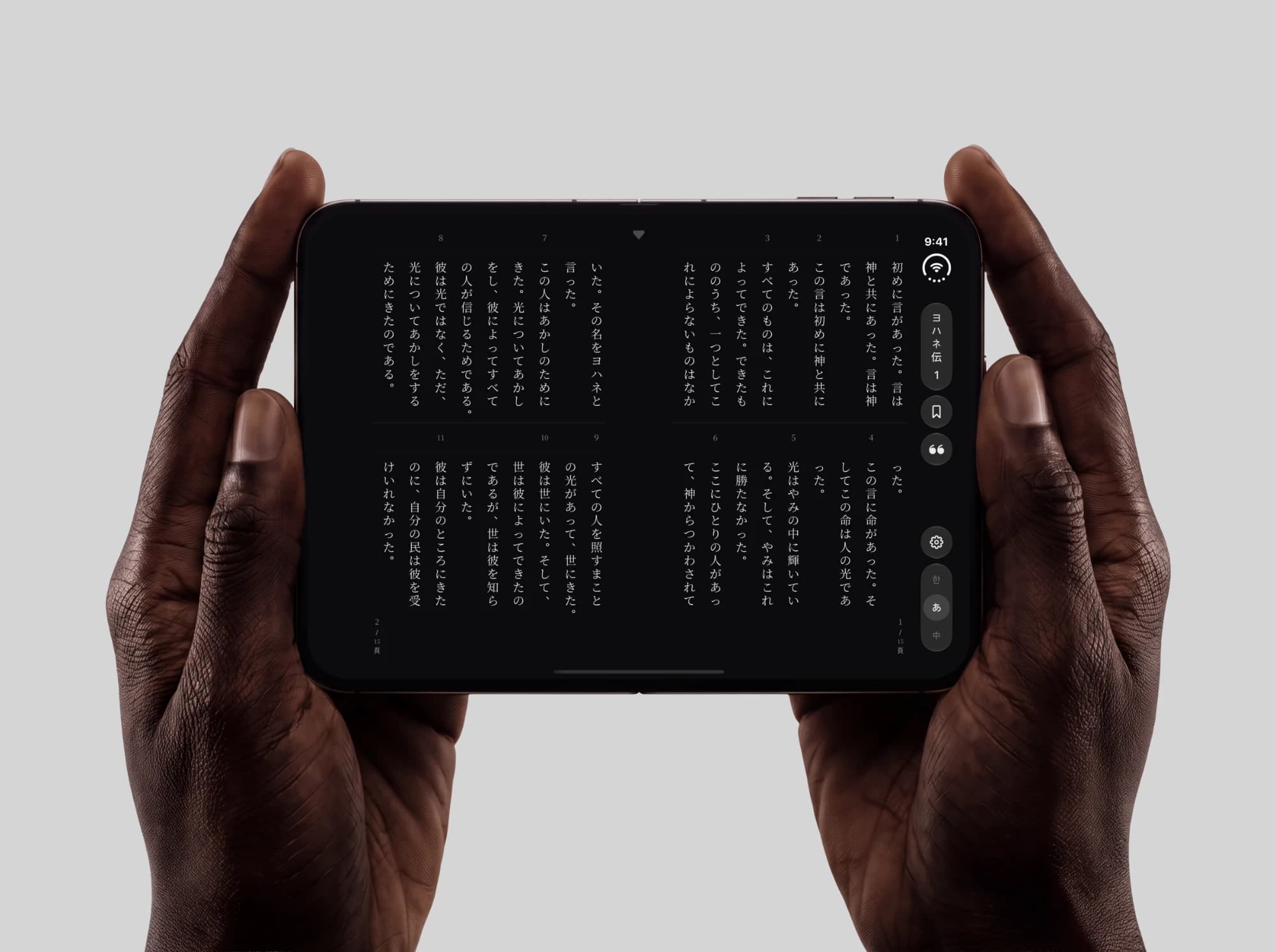
On a folding phone the chapter opens as a book: the fold is the spine, and the page turns by peeling.
A fully vertical Bible
A vertical, right-to-left Bible reader for Korean, Japanese, and Chinese. Every control, gesture, and transition works top→bottom, R→L: columns instead of pages, chrome that reads vertically, motion that tracks the reading.
The recording is the real app: verse-anchored highlights, the palette at the reading edge, and selection that travels down the column.
Up close
Pull to turn the chapter
Overscroll past the edge column and a progress ring fills as you pull. Release early and it drains; nothing fires. Pull through and the disc arms, and letting go melts the next chapter in. On device, haptic ticks climb with the ring.
The scroll and the book
The same text, two reading models. 흐름 reads like a scroll: columns flow right to left, and nothing interrupts the text. 절별 reads like a printed page: verse numbers sit in a band and the page turns one row at a time, the bottom row rising to the top.
The switch behind the sheet
The reading mode is picked from two settings cards, and the cards draw their own directions. Choose the other one and the reader restructures behind the sheet — the same chapter re-set live, scroll to book, before the sheet ever comes down.
One tap, three scripts
Translation is the language switch. The indicator slides 한 → あ → 中 and the whole reader re-typesets into the other script, each with its own vertical punctuation rules. The chrome is vertical text too, so the UI changes language with the scripture, and it gets out of the way while you read.
The walk and the palette
Where the reader answers “read this chapter”, 묵상하기 answers “sit with this one”: a single verse, and nothing advances itself. Drag up and the verse dissolves glyph by glyph in reading order, a wave running right to left, and the next one forms the same way, a verse at a time across chapter and book ends; let go early and it re-forms from where the finger left it. The 配色 sheet gives the surface its own ground and ink, seven of each named for traditional materials (墨, 藍, 和紙, 青磁, 金, 朱), and derives the whole theme from the pair, so the controls and the sheet re-ground with the verse. Left on 標準, the ink picks whichever text colour reads on the ground, and muted text is mixed toward it only as far as 4.5:1 contrast allows. The sheet has no scrim, so every choice previews on the verse itself; its third column is the reader’s own typeface, 明朝 or ゴシック.
Features
Column-based layout
Top→bottom columns that flow right-to-left. Each column is its own snap target, not a page.
Tate-chu-yoko (縦中横)
Verse numbers and digit groups like "1:1" sit upright as horizontal clusters inside the vertical stream.
Scroll-driven immersion
Read forward and the chrome collapses to reclaim the screen. Scroll back, or tap the indicator, to bring it back.
Horizontal pull-to-paginate
Overscroll past the last column to fill a progress ring and turn the chapter, haptic ticks climbing to a landing tap.
RTL-native chrome
Every control is vertical text. Navigator, drawers, and language toggle all lay out R→L, matching the reading.
Three-language support
Korean 한글 킹제임스, Japanese 口語訳, Chinese 和合本. Three full translations, one switch.
Design Decisions
Why columns, not pages?
CJK books scroll; they don't paginate. Column-snapping keeps that continuity and gives the feel of pages without the hard boundary.
Why RTL scroll direction?
In right-to-left columns, reading forward moves left, so scroll tracks the reading, not the OS default. One flipEdges constant inverts the offset sign.
Why haptic feedback for chapter turns?
The pull shows nothing until the ring appears, so haptic ticks feed back through the blind part of the gesture, the way a clock ticks.