
Vertically Canon is in public beta on TestFlight and isn't on the App Store yet. Every recording below is the iOS app itself.
Get notified at launch
Leave your email and I'll let you know the moment Vertically Canon is live.
A library you hold
Vertically Canon reads public-domain classics the way they were printed: columns top to bottom, pages right to left. Hamlet in Chinese, Romeo and Juliet in Tsubouchi Shōyō's Japanese, the Analects, Yun Dong-ju, Sōseki, Dream of the Red Chamber: thirty-odd books, each in its own language.
Forked from Vertically Verse, it keeps Verse's typesetting engine and reading layouts and asks what comes before the first page: what a shelf of vertical books looks like, how one opens, and how a reader is taught a direction that runs against habit.
The recording is the real app: a book picked up off the shelf, opened to the page where reading stopped, and set back on its cell.
Up close
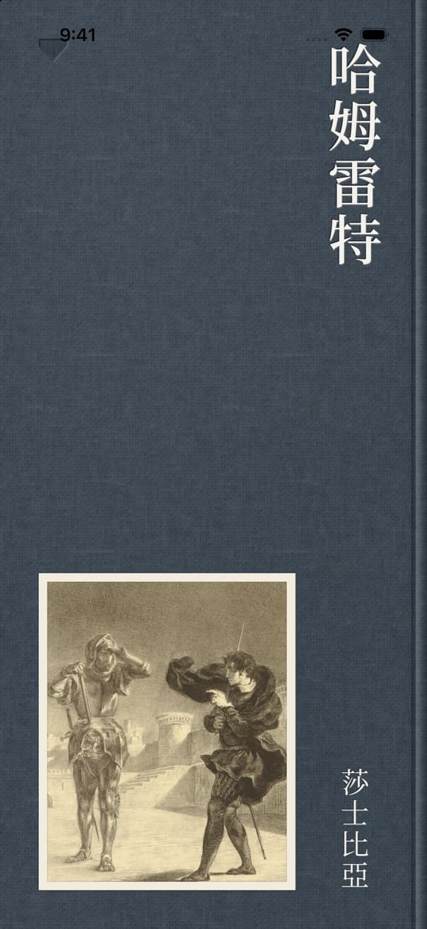
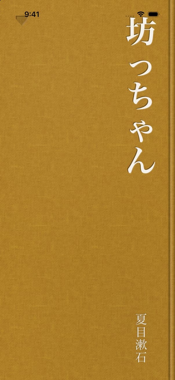
Cloth and plate
Home is a shelf without a shelf: every book is a cloth hardcover lying flat on a light ground under one lamp at the top-left. The title is foil-stamped in a vertical column on the right, the spine side, because these books bind on the right. A book whose picture is good carries it as a small tipped-in plate; the others get a large stamped title. Each cover casts four shadow layers whose direction and length come from where it sits under the lamp, recomputed on every scroll frame, so a book further down the screen casts a longer shadow.
Held open
A tap picks the book up. Its contact shadow lets go first, it tips its fore-edge toward you so the page block shows its thickness, and the cover swings open around the spine, carrying the pages you have read as one slab as thick as your progress. The last few leaves flick over, each curling from its head corner. You hold the open book for a beat while the shelf blurs and dims, then lean in until the page fills the display; the last frame is the reader's own pixels, so the hand-off has no seam. Closing runs the same path back onto the cover's cell, and a tap mid-flight reverses either one.
A filter, not a switch
The capsule on Home's rail reads 全 · 한 · あ · 中. Picking a language narrows the shelf to the books in that language and also sets the interface language, which is why 全て turns into 전체 as soon as 한 is picked. Tapping the selected language again returns to All. Every book has exactly one language, so the three filters split All with nothing left over.
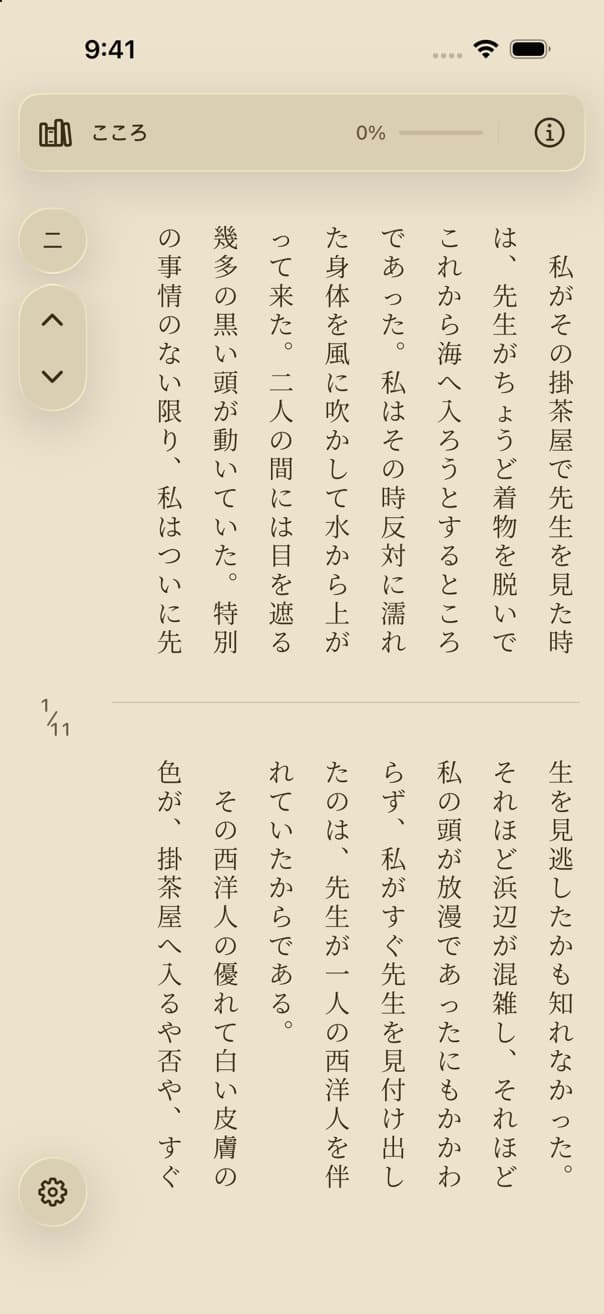
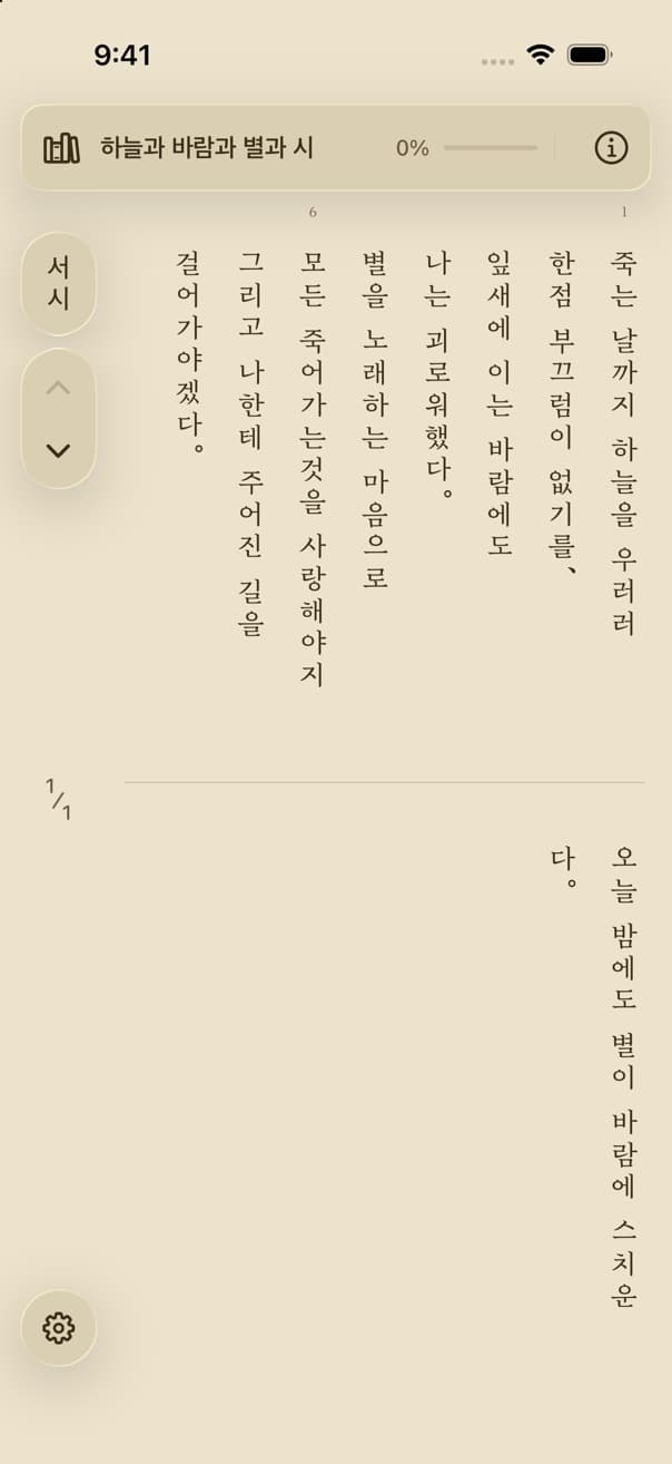
Prose, verse, drama
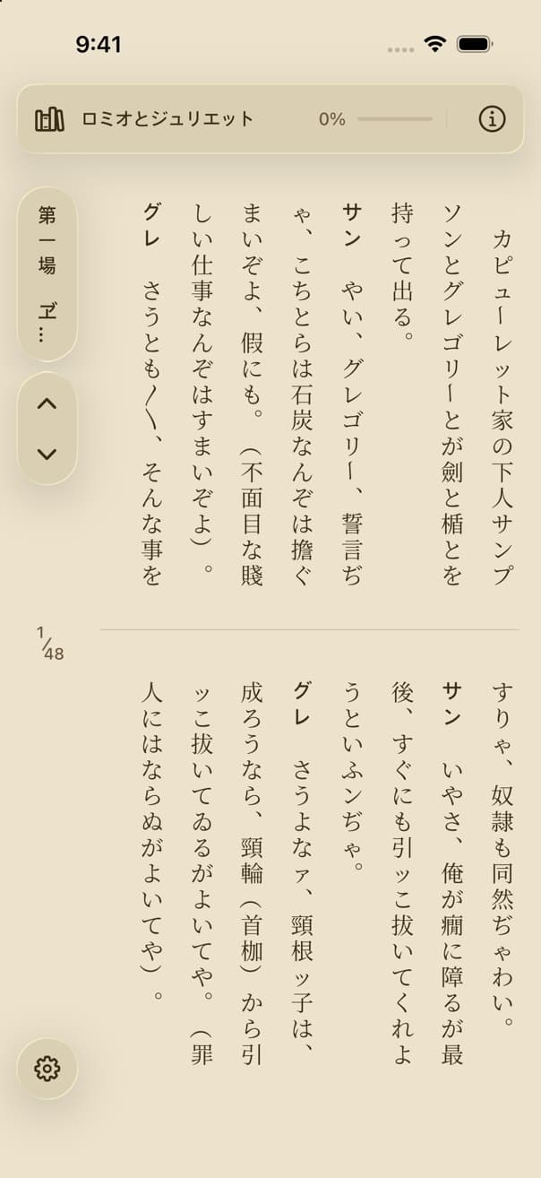
The library holds three kinds of text, and the reader sets each by its own unit. Prose runs in paragraphs. Verse runs in lines, and a numbered edition marks line 1 and every fifth line after it in the band above the tier. In drama each speech opens with its speaker in a semibold sans, then an indent, so the names stand out down the column. A full-width indent is a full-height cell that is never dropped at the top of a column.
The page and the scroll
단락별 reads like a printed page: two tiers, the upper one read right to left, then the lower. The ⌄ caret, or a swipe up, moves the page by exactly one row, so the row you were reading at the bottom rises to the top and a new one arrives below it; a line is never lost to a page break. 흐름 reads like a scroll: full-height columns in a horizontal strip that snaps column by column. Read forward and the rail folds into a small pill; scroll back and it returns. The counter in the middle of the rail tracks your place in both.
Sheets from the edges
The rail's chapter pill drops the 차례 from the top: chapter titles as vertical cells wrapped into a right-to-left grid, each section leading its row, the current chapter marked. The ⓘ in the banner drops the About sheet: the cover, the edition credit, and an introduction set vertically, its column height chosen so the text fits the card's width before the sheet has to scroll. Settings rise from the bottom, and the page re-themes live behind the glass. Each sheet closes with its ✕, a tap outside, or a swipe back toward its edge.
A tour you do
The first run starts with a language, because that choice also sets the interface; this step can't be skipped. One page then explains the direction by reading the flagship's first line out glyph by glyph, top to bottom, right column first. From there each step is finished by doing it: the tour spotlights 哈姆雷特 and you open it yourself, the coach marks step aside while the book opens, then come back to teach turning in whichever layout you are already in. The tour never changes a setting.
Bring your own
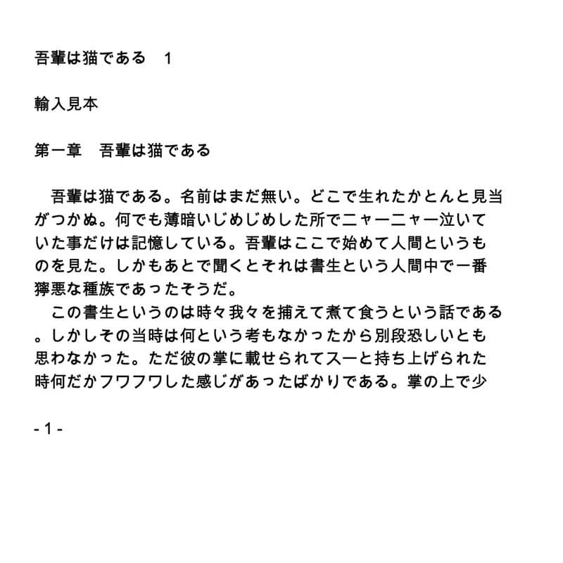
The + on Home imports a PDF or a text file. One normalizer, specified once and ported to every platform, decides the language by script, drops the running heads and page numbers that repeat across pages, rejoins hard-wrapped lines into paragraphs, splits chapters at headings such as 第一章, 제1장 or Chapter 1, and swaps punctuation for the forms vertical setting needs. The result gets a graphite cloth cover and opens like any other book. A scanned PDF with no text layer is refused rather than imported as an empty book.
Closed, still a book
On iPhone Duo's outer display the shelf keeps its two columns and the rail moves into the system's control column on the right. In 단락별 the opened book is one page of a codex rather than rows behind arrows, and it turns by peeling a leaf over its edge, the same gesture the inner display uses for its two-page spread.
Opened, a spread
Unfolded, the inner display holds the book as a right-bound spread: the right page is read first and the spine lies on the hinge. A cover lifts off the three-column shelf, opens around that spine and lands on the spread where reading stopped. Each page's text block is centred in its half of the display, and the page counter sits in the left page's margin, level with the line between the tiers. A forward turn lifts the left page over the spine; the leaf follows the finger from where it was grabbed and carries the next page's real text on its back.
Features
Set glyph by glyph
Every character is placed by kind: CJK upright, a Latin word rotated as one unit, digit runs of up to three standing side by side (縦中横), punctuation moved to its vertical position. 금칙 / kinsoku keeps closers off a column's top and openers off its foot, and no more than one mark may hang below a column.
Thirty-odd books, three scripts
Shakespeare in Chinese and Japanese, the Analects and the Dao De Jing in both, Yun Dong-ju, Kim So-wol and Han Yong-un, Sōseki and Akutagawa, The Tale of Genji, and the four great Chinese novels. Every text is public domain and normalized for vertical setting when the library is built.
A place in every book
Each book remembers its chapter and the first passage on the page. Progress counts passages, not pages, so a new text size or layout never moves the percentage. The shelf shows it under each cover: a percentage, a “new” badge before the first opening, a “finished” badge at the end.
Vertical labels on glass
Every control label is vertical text: the chapter pill, the language capsule, the settings cards. The rail, the banner, and the sheets are Liquid Glass on iOS 26. A selected control fills solid, because a material you can see through can't carry a high-contrast on state.
Faces cut to the library
The reader's serif and sans faces ship inside the app, most of them cut down to the library's own glyphs plus a common baseline per language, so a Korean, Japanese, or Chinese page sets the same on every device. The interface keeps the system faces, which fall back cleanly across scripts.
Reduce Motion and VoiceOver
Under Reduce Motion the opening becomes a 300 ms cross-fade and the sheets fade instead of sliding. VoiceOver reads the banner's bar as the library, the title, and the percentage, and the rail's counter as a page out of a total.
Design Decisions
Why open the book in 3D instead of zooming the cover?
A flat zoom only says a rectangle got bigger. Lifting the book, swinging its cover around the right-hand spine, and riffling the pages already read tells you where you are before you see a word: a thin slab means you've just begun. The move runs right to left, the way the book reads, and it can be reversed mid-flight, so a tap never feels like a commitment.
Why is Home always light?
The shelf is a scene of objects: cloth, paper plates, shadows under one lamp. A dark version needs a second set of materials that stop reading as objects. So the reader keeps its dark, sepia, and light themes, Home keeps its own tokens under all three, and the status bar flips at the moment the opening book covers the screen.
Why does a translation ship as a separate book?
With a language switch inside the reader, “where am I?” has no stable answer: a passage of classical Chinese and its Japanese reading break into different columns and pages. As two books, each keeps its own place, progress, and cover, and the shelf filter splits the library cleanly by language.
Why does the tour make you do each step?
Vertical, right-to-left reading reverses habits learned in horizontal apps, and being told that ⌄ moves a row teaches less than moving one. Each step waits for the real action, yet every step also shows its Next button from the first frame, so no gesture is ever required to get through.